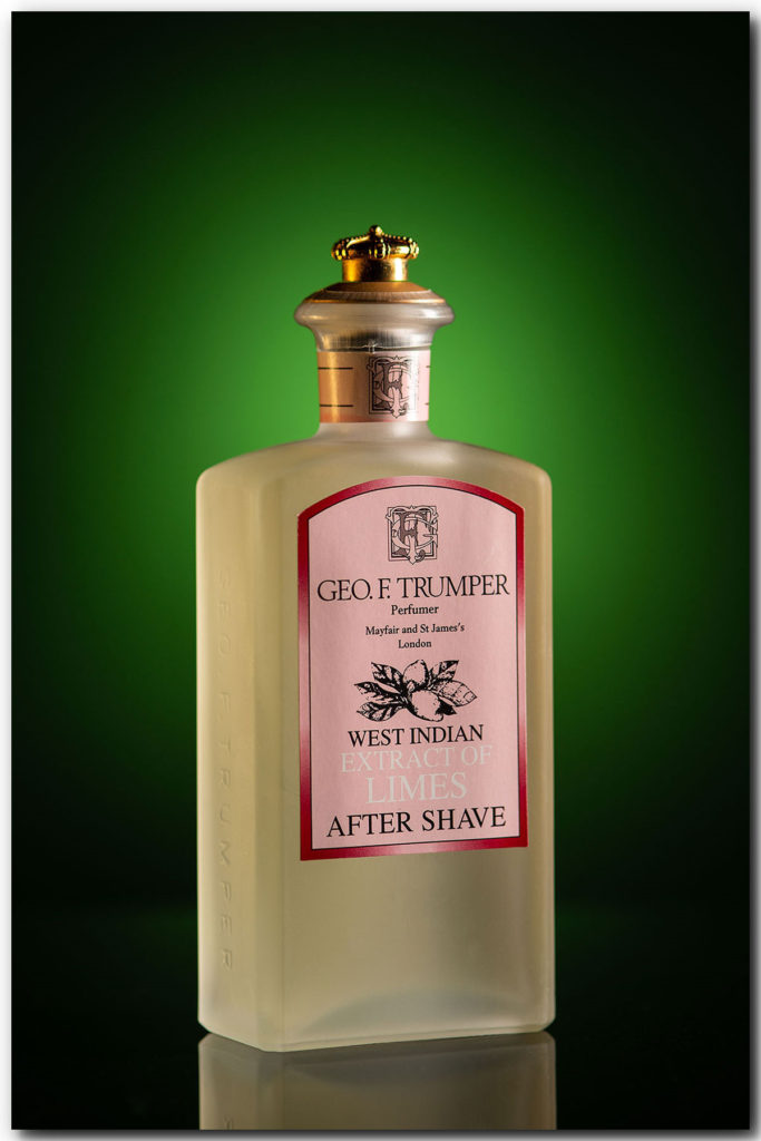

In the studio this week doing a test shot on a product view of a recent purchase from my client The Andover Shop.
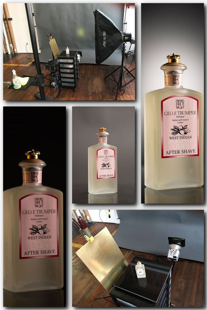
Most product views beyond the “white background look” require a little more thought and setup. For this look I started with a neutral gray background with the bottle on a black ceramic floor square for a mirrored look to the base of the bottle. Now with a spotlight on the background I highlighted the product and added depth. I then added a green gel along with a gold foil fill card which allowed me to complete the view I was going for.